

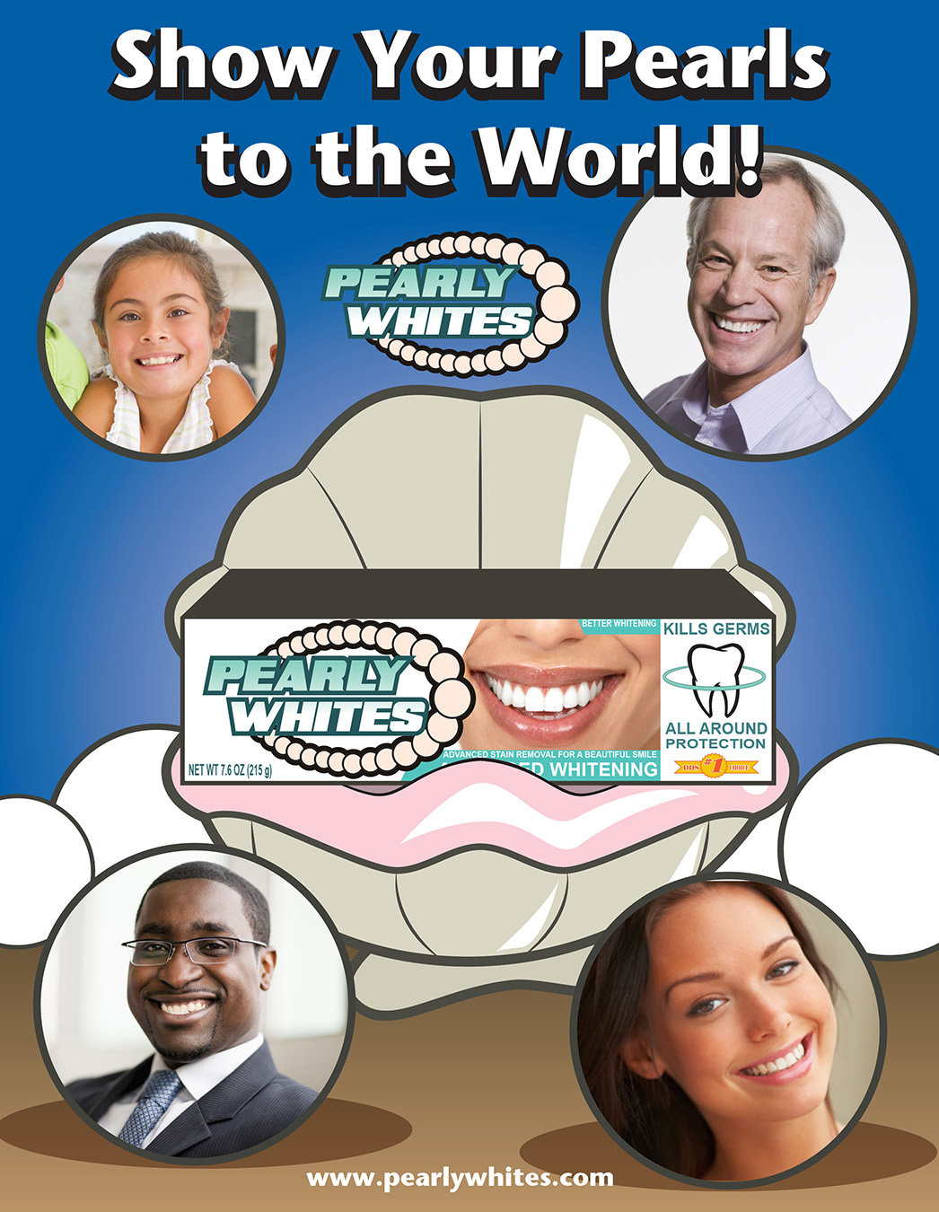
Given a toothpaste box template, a stylistic yet informative layout for customers is implemented with the logo as the final touch. Having the Pearly Whites shown on every visible side of the box allows the customer to notice the product easily. The direction for the ad was an aquatic scene with an oyster as the center image. Models with great smiles are encapsulated with circles representing the pearls emphasized in the product’s name. A false website was added to the bottom of the page to create a more believable ad. The Pearly Whites advertisement can be used as a magazine page.

Pearly Whites is a fictional brand of toothpaste. The inspiration for the design comes from the comparison of a fresh, minty smile to the beautiful, oyster pearls. As for the color choice, I selected cool colors to represent the aquatic theme. The brand has a flexible logo that be used in dental products, packages, and apparel. The project is a demonstration of logo design, box design, and advertisement design.